- May 18, 2024
Derwent Inktense supplies: Painting with blocks, pencils and paper
- Francoise Blayac
- 0 comments
Today, I'm excited to share my experience combining Inktense pencils and blocks to create a stunning landscape painting. With the addition of Inktense paper, this project turned into an interesting exploration of colors and techniques. Let's dive into the process and see how it all came together. You can watch the video below, or keep reading.
Picking a Set
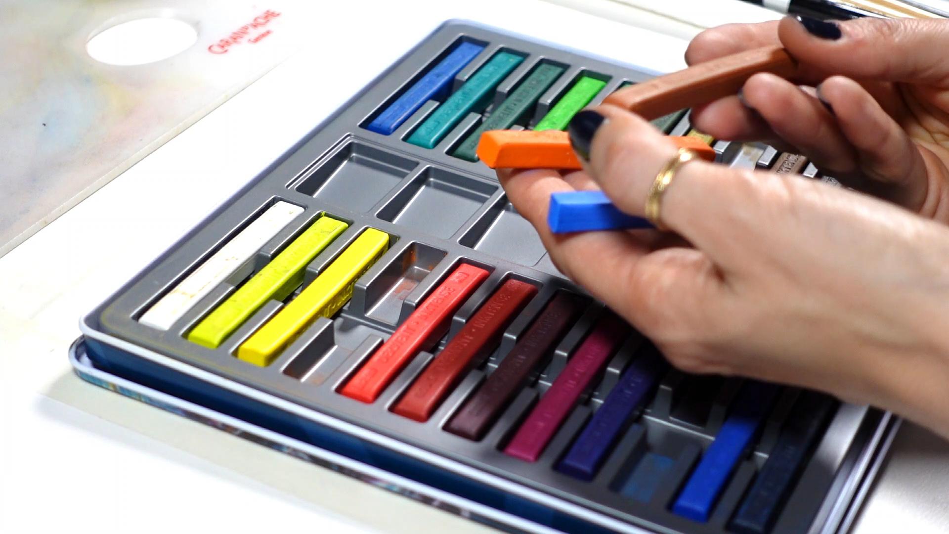
When choosing my supplies, I opted for a 24-color set of Inktense blocks and here’s why:
Leveraging color mixing: Large sets are great at first, but they can feel useless once you grasp color mixing. Over time, I've found that I needed fewer colors to achieve my desired palette and guarantee great color harmony. That's why now, I go for 12 to 24-color sets.
Cost-effective choices: If you're on a budget, small sets are plenty. My preference goes to 24 color-sets, because they include essential colors like white, which is particularly useful for adding realistic touches.
Balancing variety and practicality: A 24-color set provides a good range without the excess of larger sets, making it easier to focus on creating rather than choosing.
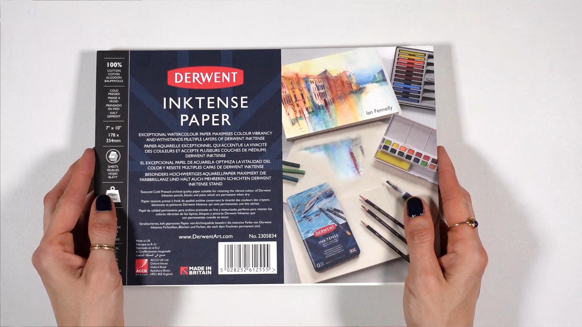
About the Paper
I recently reviewed Inktense paper (in this video here), and decided to use it for this project. Here’s what I discovered:
Quality and price: The paper is excellent but pricey. It performed well on my first try, similar to my usual 100% cotton watercolor papers.
Picking Colors
Choosing colors is a crucial step, and this is my approach:
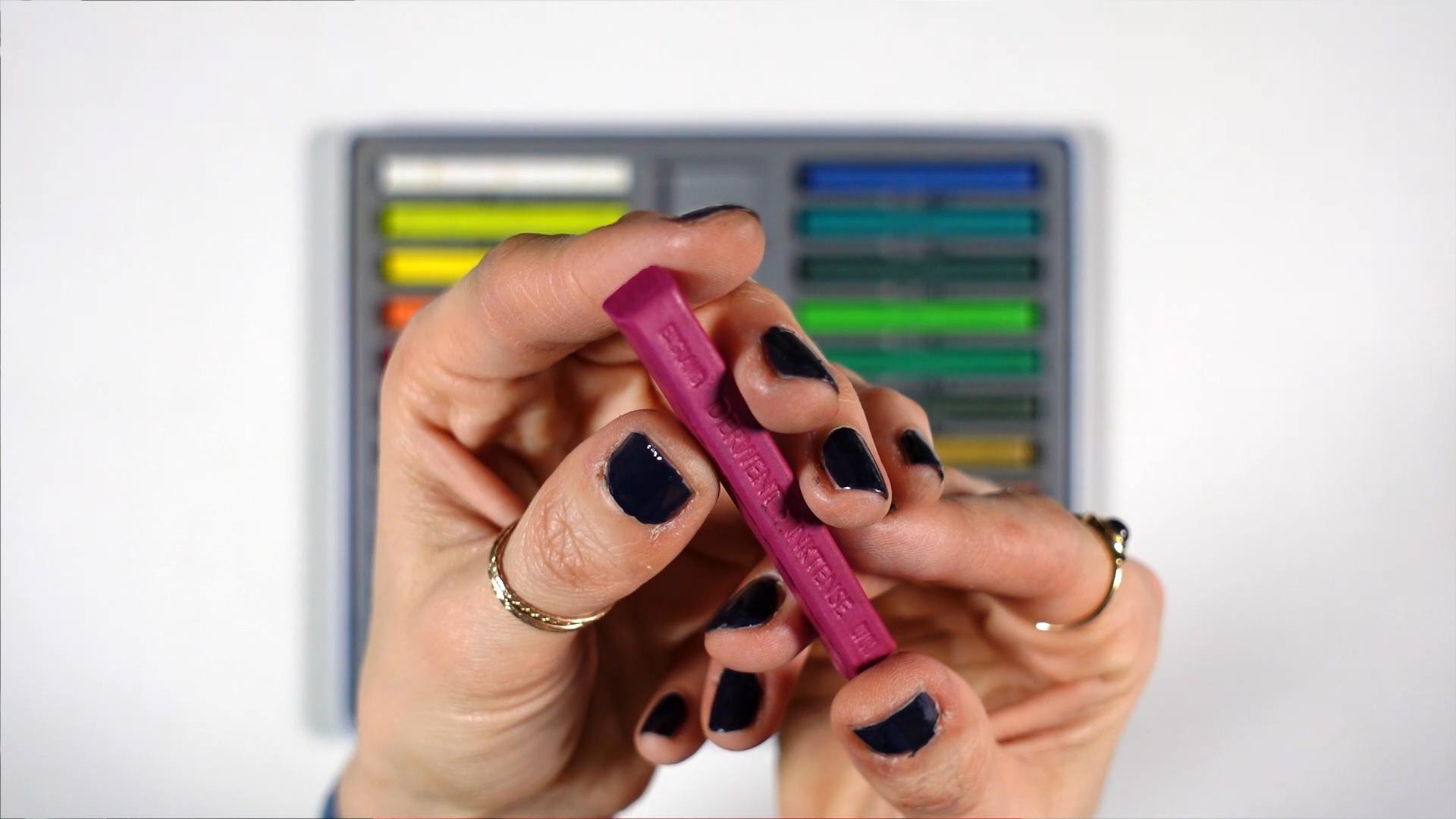
Matching blocks and pencils: I selected blocks that matched my pencil colors to ensure a cohesive look. The blocks don't have color names written on them, only numbers. Numbers match on both pencils and blocks.
Tweaking the reference: I adjusted the reference image colors to create a vibrant, summer feel. This is especially helpful when you're someone who tends to copy what you see and you want to make sure and create something colorful.
Using the Blocks
Inktense blocks are perfect for covering large areas. This is how I used them:
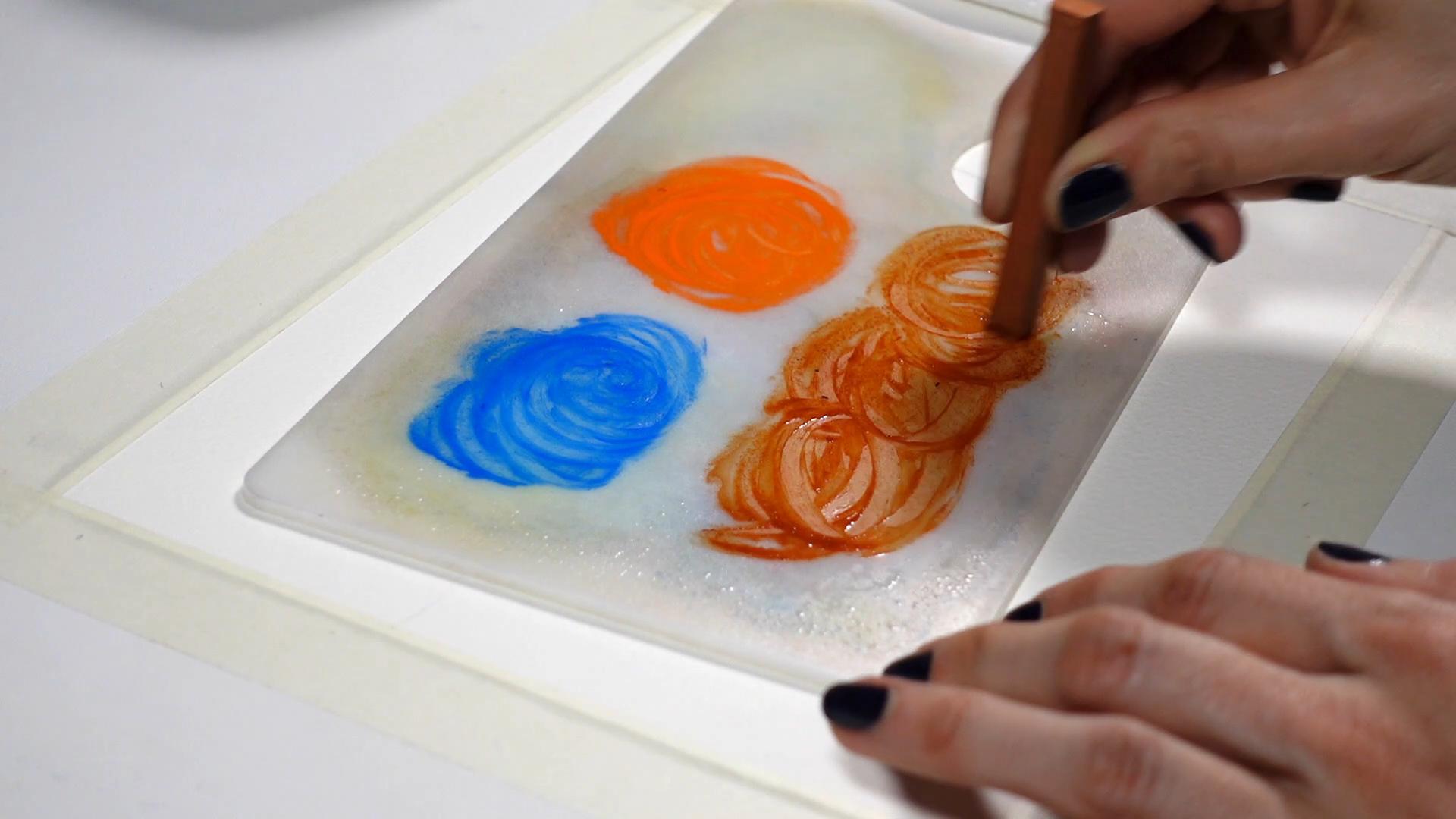
Dissolving Pigments: I pre-wet the palette and dissolved the pigments for a smooth application.
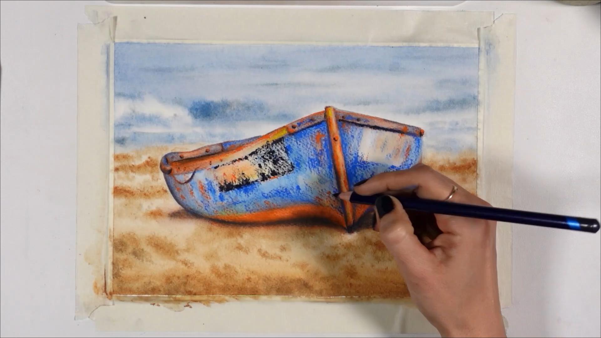
Base layer, on wet: I started with blue for the sea, muted with a touch of orange. For the sand, I used a golden color mixed with blue for depth and texture.
Direct Application: Applying the block directly to wet paper creates strong textures. A downside is it can be challenging to smooth out, unlike traditional watercolors.
Using the Pencils
Inktense pencils are great for:
Adding Detail: Pencils allow for precision, perfect for detailing the boat.
Making the main subject pop: Coloring with pencils first, then activating with a wet brush, reveals vibrant colors and smooth transitions. It's ideal to make a subject pop off the page.
Enhancing Shadows: I layered blue and orange for shadows instead of using a dark color like Payne's Grey, to achieve a balanced contrast.
Creating Realism: For realistic effects like rust on the boat, wetting the pencil lead creates textured, vibrant chunks of color.
Adding Highlights: The white Inktense pencil added subtle highlights, which I like for realism.
Combining Inktense blocks and pencils opens up a world of creative possibilities. Whether you're a beginner or an experienced artist, these versatile tools can enhance your painting process, and make it more enjoyable. Happy painting!
If you enjoyed learning about my process, join me on Patreon where you can paint along with me in real time.
And if you want to learn my watercolor pencil and water-soluble pencil techniques, check out my classes here.