- Mar 31, 2024
Watercolor landscape painting: How to keep white space
- Francoise Blayac
- 0 comments
Keeping white space in a watercolor painting can be tough, that's why as a beginner, I'd easily lose them.
I also noticed that keeping white parts from the paper sometimes looked unnatural, and when you love to paint realistic watercolors, this can be a problem.
The solution I found at the time was to use white gouache to create natural highlights on top of a finished painting.
As you can see here, this technique can look beautiful, depending on where you add the gouache, and how much of it you use.

These are some of my early paintings. Most of the highlights and foam were created with white gouache here.
Relying on white gouache, white watercolor, or any other white medium (gel pen, pencil, etc) is a great option to create a specific effect, or place these tiny highlights that are so difficult to preserve. Even master watercolor artists use them for that purpose.
However, I ran into two major issues that occurred again and again in my own paintings:
White gouache and other mediums can easily make a watercolor painting look heavy and overworked, when you rely on them too much.
I felt like I missed out on a more traditional and authentic watercolor painting experience as the years passed.
The truth is nothing beats the glow and the freshness of paper white highlights. And thankfully, this doesn't mean they have to look flashy and unnatural. There are ways to create these highlights in the most beautiful manner.
With experience and practice, I've developed a 3-step system that helped me leverage this feature while staying true to a realistic painting style.
Step one: A great reference photo
As artists, we have the power to transform a reference into whatever it is we wish to do: Change the colors, enhance an element, skip another etc
If your goal is to start keeping more white space in your paper, a good place to start is to pick a great reference photo.
When the highlights are clearly visible in your reference, it will become a lot easier to locate, and paint them.
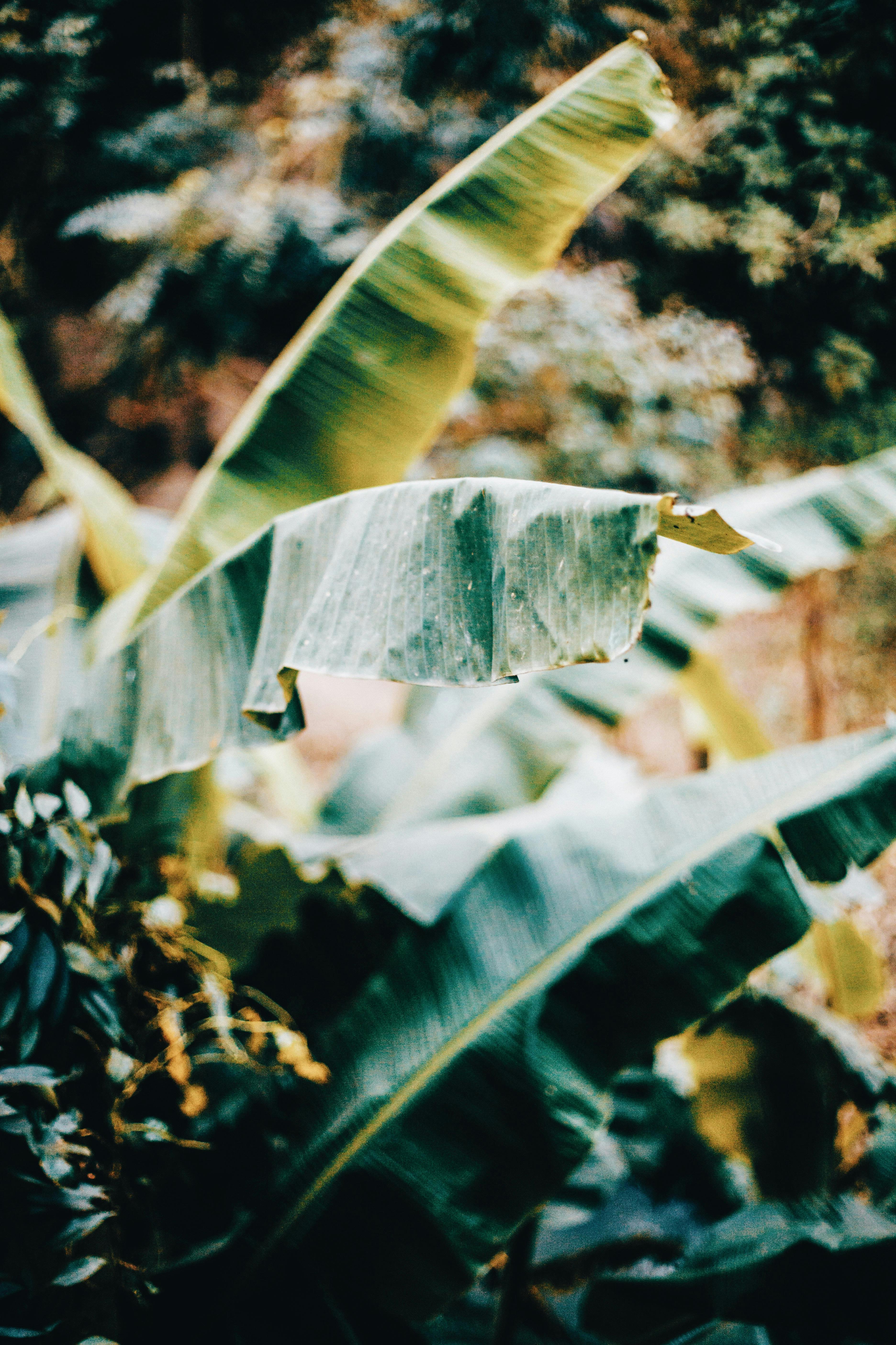
Pexels reference from Og Mpango. This photo has great contrast between the dark parts and the light ones.
Step two: Analyze the reference
You now want to take a good look at the photo and ask the following questions:
Where are the brightest parts located?
Are there any other light areas?
A popular trick here is to squint your eyes several times in a row while looking at the photo. This will help you locate the bright highlights better. Another trick is to convert the photo to a black and white version. It becomes easier to spot the various values, including those brighter areas.
Step three: Make a plan
Once you've made yourself aware of the highlights in your reference, strong or subtle, it's time to make a plan. this means you'll have to decide what technique is best to render the highlight. In the video above, I explain and show exactly how I did this with the jungle leaf painting.
I used several techniques:
I masked some of the brightest leaves with masking fluid. This technique ensured I would be able to keep bright highlights there, as well as clearly defined edges. This was helpful for the main leaf since it's not only bright, but also, the only one in focus. All other parts of the photo are blurry.
-
I avoided other leaves while painting on wet paper. I also created a sense of light in the background itself, by tapping the brush on paper to create a foliage effect. This allowed me to keep all these areas looking light enough.
Keep in mind that although this method is effective and widely used in watercolor (for painting clouds, and a lot of other things), the paint tends to creep inside the bright white parts if we're not careful, since the sheet is wet, and pigment flows wherever it can. This means we might just lose our highlight more easily. When this happens, you'll see in the video how the lifting technique can help recover those areas.
On dry paper, I used the lifting technique again, by wetting and then lifting paint with a paper towel. This helps create subtle highlights and I enjoy using this method when I want to create natural highlights on top of dark paint, or when I want to finish one of those masked bright areas to make it look a bit more natural.
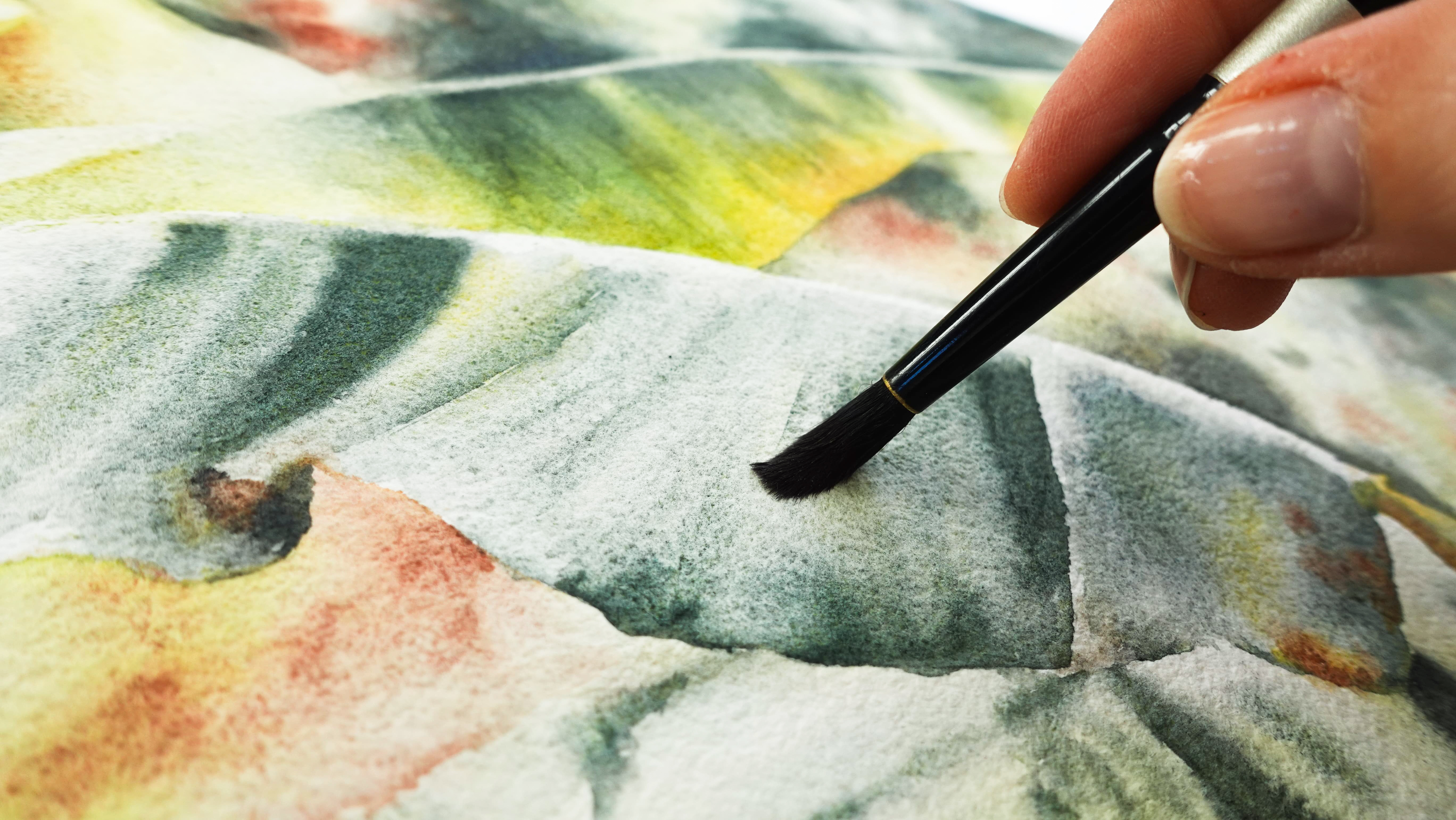
The brightest parts don't need to be 100% white. A variety of subtle tones is all you need to paint realistic whites that glow.
Let me also share my best tips when it comes to preserving white space:
For bright white paper areas to look natural in a painting, make sure to add paint to some of that area, even if it's highly diluted and barely noticeable. Bright whites aren't completely white, there are many nuances and subtle colors in whites that are found in real life.
Dark and opaque paint can bring it a light area and make it look whiter than it actually is.
Don't be afraid to layer, and make adjustments in contrast.
You can also use other mediums to enhance the white parts, a gel pen, or white gouache...small touches are best.
I didn't mention this in the video, but I find painting larger is better to practice keeping white parts.
I hope this blog post and video were helpful, see you in the next one!
Xo - Françoise
Can I help you?
➡️ You're an intermediate watercolor painter: To paint this leaf painting in real-time and voice-over, you may consider joining my Patreon.
➡️ You're a very beginner watercolor painter and you know you need to learn landscape painting basics first: you'll find everything you might need in my art school.
➡️ You're a Skillshare member (or you wish to become one), and you'd like to take a deep dive into all the techniques you can use to paint whites with watercolor: check out this class I made on painting light and shadow.