- May 10, 2024
4 Watercolor Techniques for Bright, Vibrant Paintings
- Francoise Blayac - Painting and Chocolate
- 0 comments
Have you ever found yourself caught between the desire to create realistic watercolor paintings and the need to maintain a fresh, vibrant look? As watercolor enthusiasts, we often encounter the challenge of balancing detail with brightness. And in this post, I'll share four specific watercolor techniques that can help you achieve that delicate balance, ensuring your artwork remains lively and engaging.
1. Smart Color Palette:
Before dipping your brush into the paint, I recommend coming up with a limited color palette. Why limited? It will help with color harmony in your painting and also help you focus on the actual process.
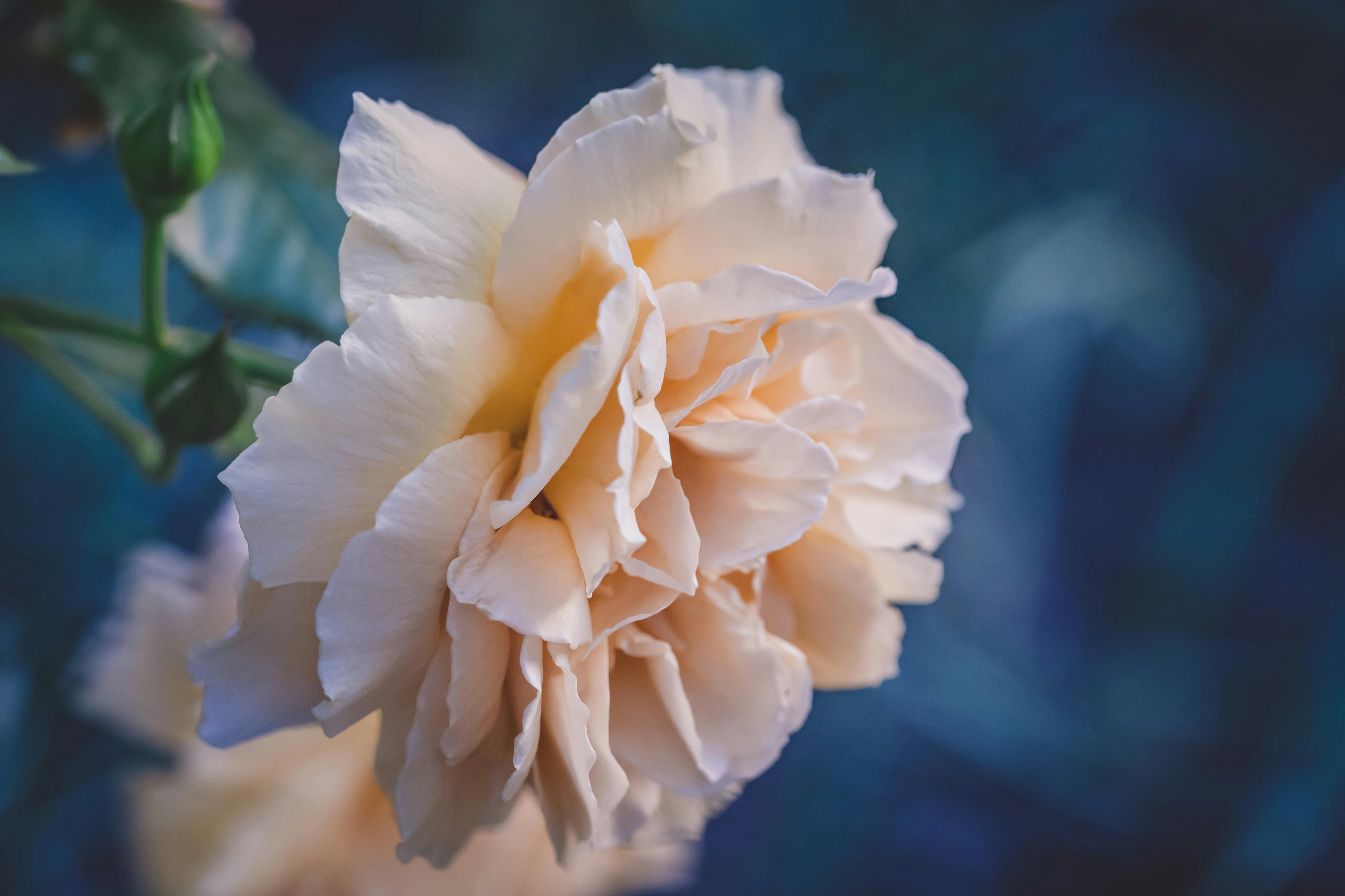
Pexels photo by Filirovska
This is what I do to make sure and keep the painting looking bright, through color choices:
I identify the main colors in the reference photo, here blue, pink, orange/yellow, brown, green....
I choose more colors that allow for easy mixing and the smart way I keep going back to painting after painting is to include the primary colors in my palette. That's why I picked ultramarine blue, Quinacridone red, Indian yellow, and indigo. Indigo helps with creating deep shadows, while the other three mix into any color I see here.
No matter the final color palette, I try and utilize bright colors to maintain vibrancy. Light and bright colors are easy to manipulate. You can make them darker, and muted... Ultramarine blue, Quinacridone red, and Indian yellow are fairly bright.
I experiment with color combinations between my chosen colors to achieve desired tones and contrasts. Here, indigo will help the shadows, while paper white areas can help with the highlights.

2. Preserving Highlights:
Preserving highlights in watercolor painting is often crucial to capture the essence of brightness and freshness. By understanding the importance of leaving areas untouched, softening edges, and avoiding over-reliance on white gouache, you can ensure your paintings maintain a natural, dimensional look while enhancing their overall luminosity.
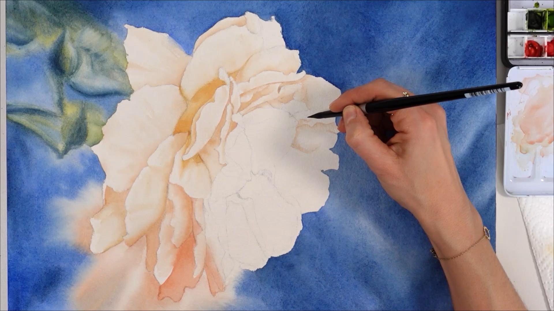
Try and do it whenever possible and applicable. I did it on wet, in the background. On dry, I also left a lot of white areas in the flower.
Avoid over-reliance on white gouache, as it can dull other colors.
Use clean, damp brushes to soften edges and create smooth transitions between painted and unpainted areas. This is my preferred way to paint "whites" that look soft and natural, on dry, as shown in the painting of the flower.
3. Layering:
By mastering the technique of applying successive layers of color, you can balance shadow and light, gradually building up intensity, and you can infuse your paintings with complexity and dimension.
Ensure the base layer is fully dry before applying subsequent layers. I've shown it in the flower. After the base layer was dry, I added a second layer.
Experiment with overlapping colors to create subtle shifts in tone and hue. This looks so much more realistic and natural!
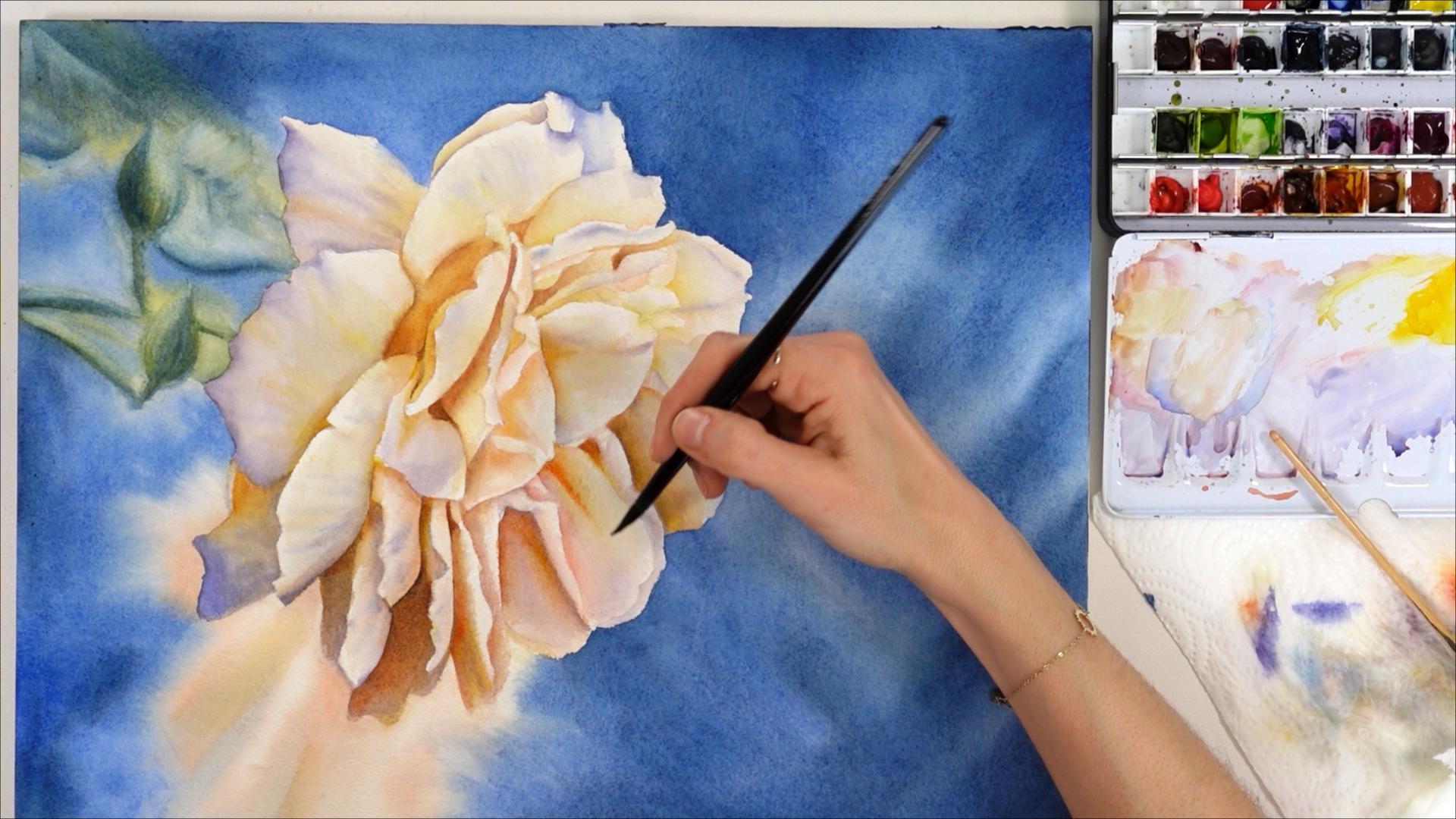
Gradually build up darker layers around the highlights. Here, I've done it to paint the small creases and hollow areas between petals. This helps to make the artwork look 3D.
Take a gradual approach to layering, adjusting pigment intensity as needed to avoid overworking the painting. This means it's better to start out with light colors, or mixes of paint that aren't too saturated in color. I start with paint mixes that look like milk. On a second layer, I add more paint to the mix to make it thicker. The more layers, the more paint there should be in your mixes. This will help the colors show, and even become opaque in places when needed.

4. Glazing:
Glazing is a transformative technique, it can add luminosity and depth to a painting in seconds. How? By delicately applying transparent layers of color over dry areas, strategically emphasizing certain elements.
Use the glazing technique as a quick and effective way to enhance color intensity. I made the decision to add Indian yellow to this white flower because I knew it would contrast better with the blue background than a white, light pink color.
Focus on strategic areas to highlight and intensify, there's no need to glaze every part in the painting. It depends on the subject and the reason why you're glazing more color on top. Here, I just needed to add some glow to this flower.
Mastering watercolor techniques is a journey that involves striking a delicate balance between realism and vibrancy, by incorporating smart color palettes, preserving highlights, embracing layering, and experimenting with glazing.
Remember, practice and experimentation are key, so don't be afraid to explore and refine these techniques to suit your artistic style. Happy painting!
Can I help you?
➡️ You're an intermediate watercolor painter: To paint this peony in real-time, with voice-over, you may consider joining my Patreon
➡️ You're a very beginner watercolor painter and you know you need to learn landscape painting basics first: you'll find everything you might need in my art school.
➡️ You're a Skillshare member (or you wish to become one), and you'd like to take a deep dive into all the techniques you can use to paint realistically with watercolor, check out my classes.